Vue的不同实现动画效果的方案
Vue开发者调试工具
vue-devtools是基于Google Chrome浏览器的一个用于调试Vue应用的开发者浏览器扩展
https://github.com/vuejs/devtools-v6
动态样式绑定
<div :class="className">字符串写法</div>
<div :class="{class2:true,class3:false}">对象写法</div>
<div :class="[class1,class2]">数组写法</div>
<div :class="[class1,class2,{class3:true}]">数组写法</div>
过渡&动画
过渡动画
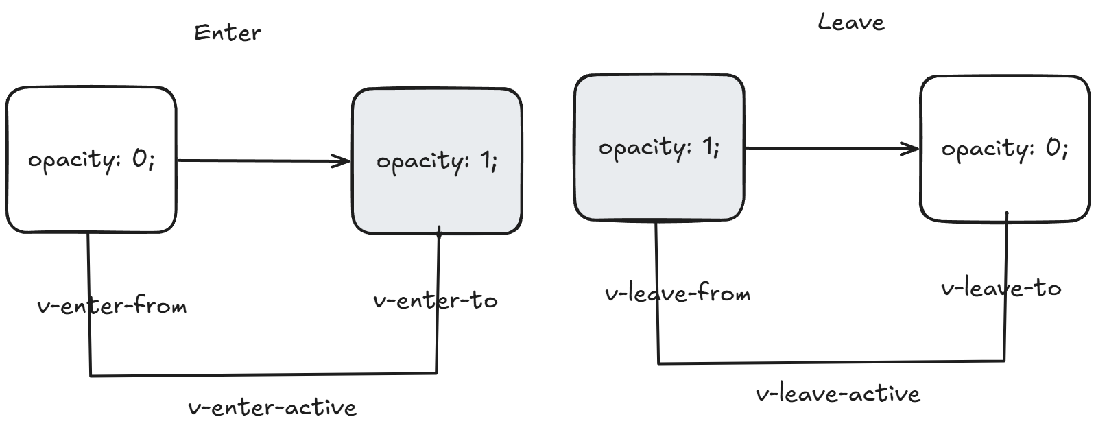
基于CSS样式实现的动画效果,开发者需要编写自定义动画样式,样式名不能随意命名,需要遵循一定的规则标准,划分为开始动画和结束动画。
开始动画类名主要只有三个,v-enter-from(进入动画起始),v-enter-active(进入动画生效),v-enter-to(进入动画结束);
结束动画的类名与开始动画类名是对应的,
主要有三个,v-leave-from(离开动画起始),v-leave-active(离开动画生效),v-leave-to(离开动结束)
动画类名中的V指的是用户自定义的动画样式类名,而不是字面意义上的字母V。
简单示例:
<script setup>
import { ref } from 'vue';
const isShow = ref(false);
</script>

<template>
  <button @click="isShow = !isShow" style="position: absolute;top: 100px;left: 100px;">点击</button>
  <transition name="fade">
    <div class="box" v-show="isShow">
      <h1>Hello World</h1>
    </div>
  </transition>
</template>

<style scoped>
.fade-enter-from{
  opacity: 0;
  transform: translateX(-100px);
}
.fade-enter-active{
  transition: opacity 0.5s, transform 0.5s;
}
.fade-enter-to{
  opacity: 1;
  transform: translateX(0);
}

.fade-leave-from{
  opacity: 1;
  transform: translateX(0);
}
.fade-leave-active{
  transition: opacity 0.5s, transform 0.5s;
}
.fade-leave-to{
  opacity: 0;
  transform: translateX(100px);
}
</style>
逐帧动画
CSS的过渡动画只能实现开始与结束的动画效果,而animation动画却可以实现更丰富、更细腻的动画效果。不过对于Vue来说,不管是过渡动画还是逐帧动画,用户都是利用6个样式类来实现
<script setup>
import { ref } from 'vue';
const isShow = ref(false);
</script>

<template>
  <button @click="isShow = !isShow" style="position: absolute;top: 100px;left: 100px;">点击</button>
  <transition name="fade">
    <div class="box" v-show="isShow">
      <h1>Hello World</h1>
    </div>
  </transition>
</template>

<style scoped>

.fade-enter-active{
  animation: fade-in 0.5s;
}

.fade-leave-active{
  animation: fade-out 0.5s;
}
@keyframes fade-in{
  0%{
    opacity: 0;
    transform: translateX(-100px);
  }
  100%{
    opacity: 1;
    transform: translateX(0);
  }
}
@keyframes fade-out{
  0%{
    opacity: 1;
    transform: translateX(0);
  }
  100%{
    opacity: 0;
    transform: translateX(100px);
  }
}
</style>
第三方动画库
https://github.com/animate-css/animate.css
JavaScript动画
除了使用CSS实现动画效果,还支持JavaScript的操作实现,transition组件还提供了8个有关JavaScript的动画钩子函数,
钩子函数包括两个参数,即el和done,其中,el是要操作的目标元素,done是一个函数,代表过渡是否结束。
<script setup>
import { ref } from 'vue';
const isShow = ref(false);

const beforeEnter = (el) => {
  console.log('进入动画开始前');
  el.style.opacity = 0;
  el.style.transform = 'translateX(-100px)';
}

const enter = (el, done) => {
  console.log('进入动画进行中');
  let start = null;
  const animate = (timestamp) => {
    if (!start) start = timestamp;
    const progress = timestamp - start;
    const opacity = Math.min(progress / 500, 1);
    const translateX = -100 + (100 * opacity);

    el.style.opacity = opacity;
    el.style.transform = `translateX(${translateX}px)`;

    if (progress < 500) {
      requestAnimationFrame(animate);
    } else {
      done();
    }
  }
  requestAnimationFrame(animate);
}

const afterEnter = (el) => {
  console.log('进入动画结束后');
  el.style.opacity = 1;
  el.style.transform = 'translateX(0)';
}

const enterCancelled = (el) => {
  console.log('进入动画被取消');
}

const beforeLeave = (el) => {
  console.log('离开动画开始前');
  el.style.opacity = 1;
  el.style.transform = 'translateX(0)';
}

const leave = (el, done) => {
  console.log('离开动画进行中');
  let start = null;
  const animate = (timestamp) => {
    if (!start) start = timestamp;
    const progress = timestamp - start;
    const opacity = 1 - Math.min(progress / 500, 1);
    const translateX = 100 * (1 - opacity);

    el.style.opacity = opacity;
    el.style.transform = `translateX(${translateX}px)`;

    if (progress < 500) {
      requestAnimationFrame(animate);
    } else {
      done();
    }
  }
  requestAnimationFrame(animate);
}

const afterLeave = (el) => {
  console.log('离开动画结束后');
  el.style.opacity = 0;
  el.style.transform = 'translateX(100px)';
}

const leaveCancelled = (el) => {
  console.log('离开动画被取消');
}
</script>

<template>
  <button @click="isShow = !isShow" style="position: absolute;top: 100px;left: 100px;">点击</button>
  <transition
    @before-enter="beforeEnter"
    @enter="enter"
    @after-enter="afterEnter"
    @enter-cancelled="enterCancelled"
    @before-leave="beforeLeave"
    @leave="leave"
    @after-leave="afterLeave"
    @leave-cancelled="leaveCancelled"
  >
    <div class="box" v-show="isShow">
      <h1>Hello World</h1>
    </div>
  </transition>
</template>

<style scoped>
.box {
  position: absolute;
  top: 200px;
  left: 100px;
}
</style>
requestAnimationFrame 是一个浏览器提供的 API,用于优化动画性能。
主要作用
告诉浏览器你希望执行一个动画
请求浏览器在下次重绘之前调用指定的回调函数
通常用于实现流畅的动画效果
在实际开发中,CSS 动画比 JavaScript 动画使用得更广泛
JavaScript 动画主要用于以下场景:
- 需要精确控制动画过程
- 需要与用户交互实时响应的动画
- 复杂的动画逻辑(如游戏、物理效果)
- 需要动态计算动画参数的情况
多元素分组动画
必须设置 tag 属性来指定渲染的标签
每个子元素必须设置唯一的 key 属性
三种动画状态
进入动画(.list-enter-active)
离开动画(.list-leave-active)
移动动画(.list-move)
<script setup>
import { ref } from 'vue';

const list = ref([
  { id: 1, text: '项目 1' },
  { id: 2, text: '项目 2' },
  { id: 3, text: '项目 3' }
]);

let nextId = 4;

const addItem = () => {
  list.value.push({
    id: nextId++,
    text: `项目 ${nextId - 1}`
  });
};

const removeItem = (id) => {
  const index = list.value.findIndex(item => item.id === id);
  if (index !== -1) {
    list.value.splice(index, 1);
  }
};
</script>

<template>
  <div class="container">
    <button @click="addItem" class="btn">添加项目</button>

    <transition-group name="list" tag="ul" class="list">
      <li v-for="item in list"
          :key="item.id"
          class="list-item"
          @click="removeItem(item.id)">
        {{ item.text }}
      </li>
    </transition-group>
  </div>
</template>

<style scoped>
.container {
  padding: 20px;
}

.btn {
  padding: 8px 16px;
  margin-bottom: 20px;
  background-color: #4CAF50;
  color: white;
  border: none;
  border-radius: 4px;
  cursor: pointer;
}

.list {
  list-style: none;
  padding: 0;
  margin: 0;
}

.list-item {
  padding: 10px;
  margin: 5px 0;
  background-color: #f0f0f0;
  border-radius: 4px;
  cursor: pointer;
  transition: all 0.3s ease;
}

.list-item:hover {
  background-color: #e0e0e0;
}

/* 进入动画 */
.list-enter-active {
  animation: slide-in 0.5s ease-out;
}

/* 离开动画 */
.list-leave-active {
  animation: slide-out 0.5s ease-out;
  position: absolute;
}

/* 移动动画 */
.list-move {
  transition: transform 0.5s ease;
}

@keyframes slide-in {
  from {
    opacity: 0;
    transform: translateX(-100px);
  }
  to {
    opacity: 1;
    transform: translateX(0);
  }
}

@keyframes slide-out {
  from {
    opacity: 1;
    transform: translateX(0);
  }
  to {
    opacity: 0;
    transform: translateX(100px);
  }
}
</style>